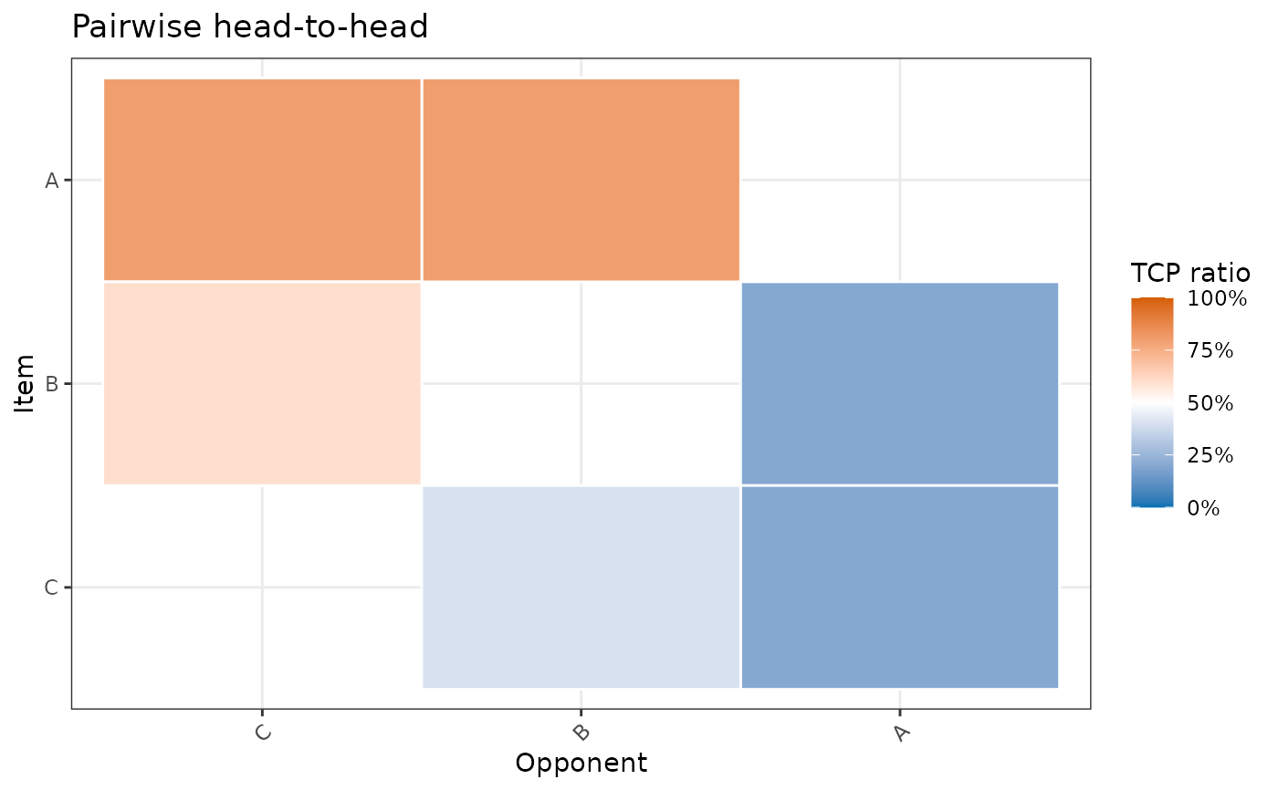
Plots a full N×N heatmap of pairwise results from a pairwise_calculator()
object. Each cell shows how the row item performed against the column item.
Color always encodes the TCP ratio (green = win, red = lose, white = 50/50).
Usage
pairwise_heatmap(x, value = c("tcp", "count"))Arguments
- x
A
pairwiseobject returned bypairwise_calculator().- value
"tcp"(default) or"count". Controls the tile annotation:"tcp": shows the TCP percentage, e.g."56.8%"."count": shows the raw vote count, e.g."2841".
See also
pairwise_calculator() to compute the input object.
Examples
library(prefio)

prefs <- data.frame(
  A = c(1, 1, 1, 2, 2),
  B = c(2, 2, 3, 1, 3),
  C = c(3, 3, 2, 3, 1)
) |>
  wide_preferences(col = vote, ranking_cols = A:C)

result <- pairwise_calculator(prefs, preferences_col = vote)
pairwise_heatmap(result, value = "tcp")

pairwise_heatmap(result, value = "count")