Comparing GPT-4.1 and GPT-5.1 alt-text outputs
compare-gpt-models.Rmd
library(autoalt)
library(ggplot2)
library(dplyr)
#>
#> Attaching package: 'dplyr'
#> The following objects are masked from 'package:stats':
#>
#>     filter, lag
#> The following objects are masked from 'package:base':
#>
#>     intersect, setdiff, setequal, union

# Built-in datasets from ggplot2 and base R
data("economics", package = "ggplot2")
data("airquality")
Overview
This vignette demonstrates how the package generates alt-text for data visualisations from a Quarto document, and compares the quality of alt-text outputs from two different OpenAI models: GPT-4.1 and GPT-5.1.
We use a small “economic and environmental” report as a worked example. The Quarto document includes three figures:
- A time-series of US unemployment
(
fig-unemployment). - A bar chart of average ozone by month
(
fig-ozone-month). - A set of density curves for temperature by month
(
fig-temp-density)
The goal is not to “prove” one model is universally better, but to show how they behave in this specific alt-text task and to justify a sensible default choice.
The example Quarto document
The underlying Quarto file test-2.qmd contains three
figures:
- Unemployment over time: a single line chart showing monthly unemployment counts over several decades.
- Average ozone by month: a column chart of mean ozone concentration across the warmer months.
- Temperature distributions by month: overlapping density curves comparing daily maximum temperatures by month.
economics |>
  ggplot(aes(x = date, y = unemploy)) +
  geom_line(linewidth = 0.6) +
  labs(
    title = "Total Number of Unemployed Persons in the US Over Time",
    x = "Year",
    y = "Number of Unemployed (thousands)"
  ) +
  theme_minimal()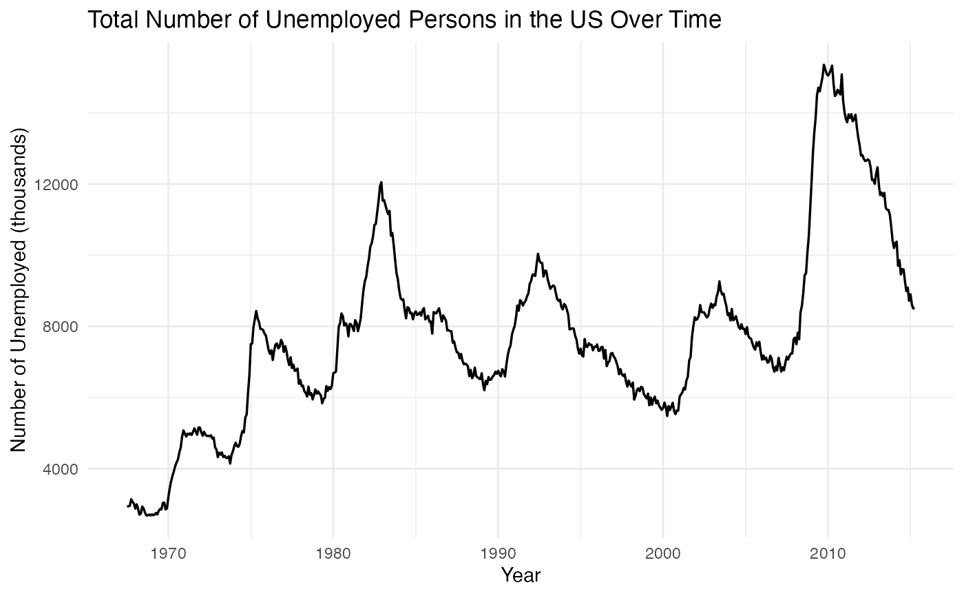
airquality |>
  group_by(Month) |>
  summarise(
    mean_ozone = mean(Ozone, na.rm = TRUE),
    .groups = "drop"
  ) |>
  ggplot(aes(x = factor(Month), y = mean_ozone)) +
  geom_col() +
  labs(
    title = "Average Ozone Levels by Month in New York",
    x = "Month (May–September)",
    y = "Mean Ozone (ppb)"
  ) +
  theme_minimal()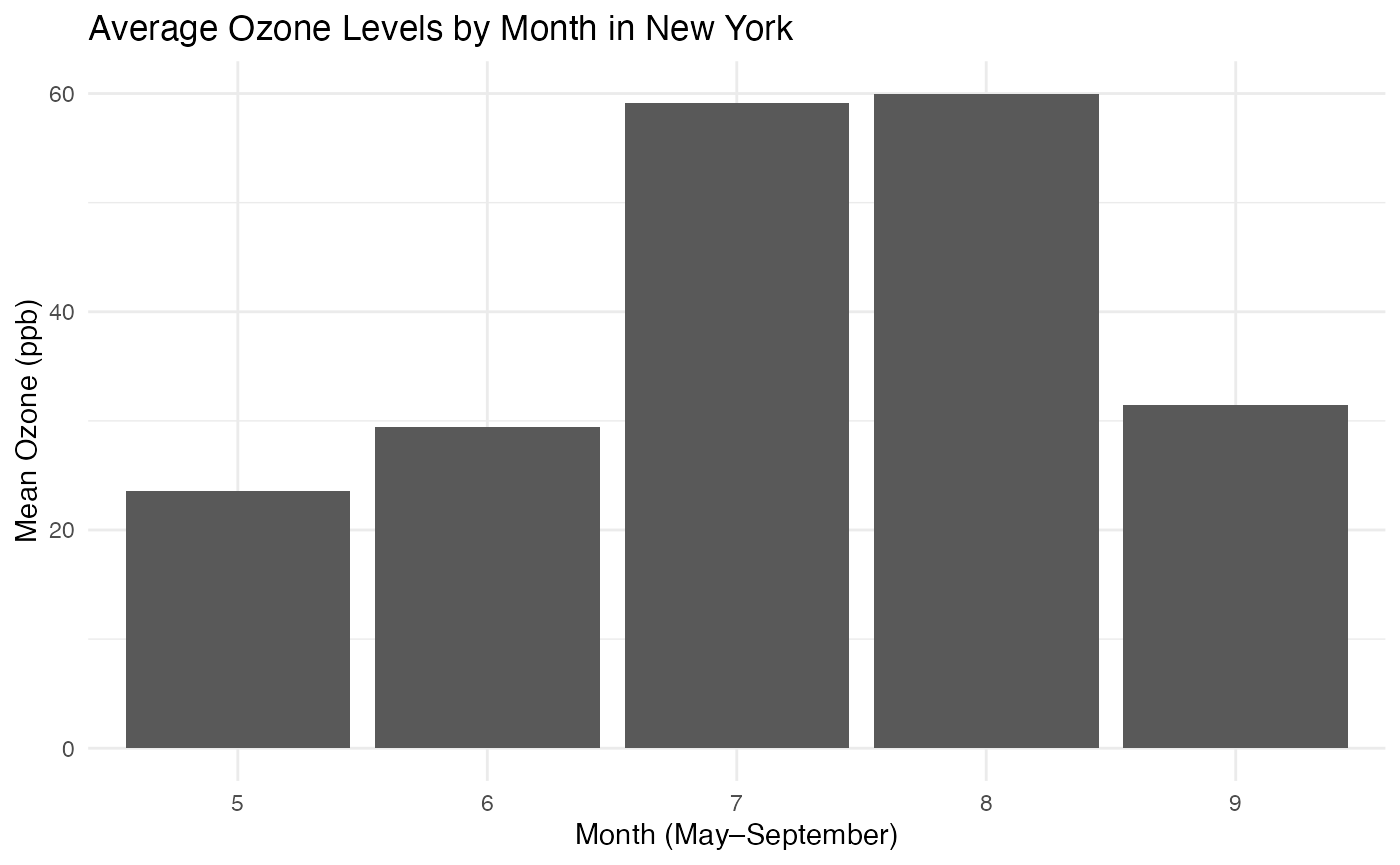
airquality |>
  filter(!is.na(Temp)) |>
  ggplot(aes(x = Temp, fill = factor(Month))) +
  geom_density(alpha = 0.5) +
  labs(
    title = "Distribution of Daily Temperatures by Month in New York",
    x = "Daily Maximum Temperature (°F)",
    fill = "Month"
  ) +
  theme_minimal()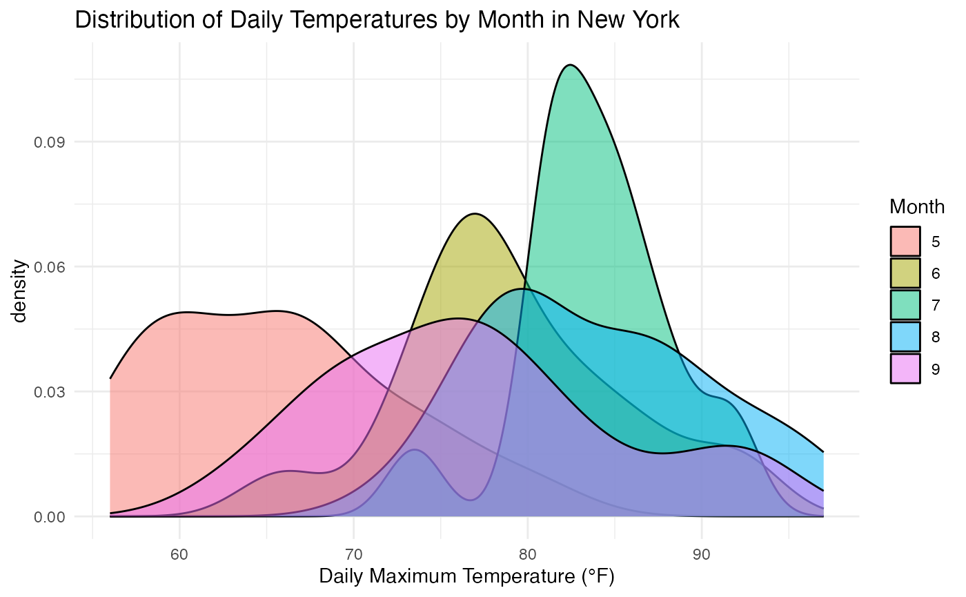
Each figure has an accompanying caption describing the main message in plain language. The package reads this Quarto file, locates the labelled figures, and then asks the model to produce:
- A single block of alt-text.
- A short checklist (inspired by a separate work) confirming that the alt-text covers key ingredients (chart type, axes, scales, visual encodings, patterns, and explicit assumptions).
Generating alt-text with different models
In practice, you can swap models simply by changing the
openai_model argument in
generate_alt_text().
Each call returns a structure in a text file, with one section per figure, including the chunk label, the AI-generated alt-text, an alt-text 6-item check list, and some metadata.
What GPT5.1 produces
For all three figures, GPT5.1 generates alt-text that is:
- Detailed and expansive. The descriptions tend to be long, unpacking the layout, axis directions, visual encodings, and visible patterns in multiple sentences. For example, the unemployment plot is described as a “single time-series line graph” with a careful explanation of the axis roles, the cyclical “waves” in the line, and the absence of other encodings such as points or facets.
- Explicit about assumptions. Each section ends with an “Assumptions” paragraph that spells out what is inferred (e.g. the exact date range, units, or colours when they are not stated in the prompt).
- Thorough about visual patterns. GPT-5.1 spends time describing the shape of clusters and curves (for example, “arch-shaped” bar heights for ozone and “peaks at cooler values” for early-season temperature densities), so that a reader can build a fairly detailed mental picture.
Overall, GPT-5.1 behaves like a cautious, very thorough describer. The trade-off is that the alt-text is relatively long and sometimes borders on repeating the caption content in narrative form.
# # Chunk label: fig-unemployment --------------------
# ## Alt-text: A single time-series line graph shows the number of unemployed persons in the United States by month over several decades. The horizontal axis displays time in months and years, running from the mid-20th century to the early 21st century (approximate range, as exact years are not specified), while the vertical axis shows the count of unemployed people, increasing from low to high values (exact numerical scale is not visible). A single line, likely drawn in a solid colour, tracks unemployment over time. The line exhibits clear cyclical waves: unemployment rises sharply to pronounced peaks during economic downturns, then falls back to marked troughs in stronger labour market periods. Some peaks remain elevated for longer stretches, indicating prolonged recessions, whereas other periods show lower, relatively stable unemployment, signalling healthier employment conditions. No individual points, colours by group, or facets are indicated; the emphasis is on the overall pattern of repeated rises and falls over the decades.
#
# Assumptions: The exact start and end years and the precise numeric range on the unemployment axis are not provided; they are assumed to cover several post-war decades with a vertical scale sufficient to show major cyclical swings. The line is assumed to be a single solid colour with no additional encodings such as markers or confidence bands.
#
# Checklist:
# 1. Identified chart type. YES
# 2. Named axes and variables. YES
# 3. Mentioned approximate ranges or scales (where meaningful). YES
# 4. Described data mappings (e.g. colour/shape/size/facets). YES
# 5. Described main patterns, trends, or clusters. YES
# 6. Explicitly noted any assumptions. YES
#
# ## Caption (for reference): @fig-unemployment shows monthly counts of unemployed persons in the United States over several decades. The time-series line reveals pronounced cyclical behaviour, with distinct peaks during economic downturns and troughs in stronger labour market periods. Longer stretches of elevated unemployment highlight prolonged recessions, while periods with lower, more stable values suggest relatively healthy employment conditions.
#
# ## Usage: BrailleR, Cummulated cost: NA, Cummulated token usage: 0
#
#
# # Chunk label: fig-ozone-month --------------------
# ## Alt-text: A vertical bar chart displays average ozone concentration by month across the warmer part of the year. The horizontal axis lists months from late spring through summer into early autumn (for example, May to September), while the vertical axis shows mean ozone level on a continuous scale (exact units and numeric range are not specified but increase from low at the bottom to high at the top). Each month is represented by a single bar of uniform colour and width, with no additional colour groups, shapes, or facets. Bar heights rise from late spring into midsummer, where one or two central months have the tallest bars, then decline again toward the end of the season. This forms an approximate arch-shaped pattern, indicating that average ozone pollution is lowest at the cooler edges of the warm season and highest in the hottest, sunniest months.
#
# Assumptions: The exact months (e.g., May–September), the units of ozone concentration, and the specific vertical scale are not provided and are inferred from the description. Bars are assumed to be a single solid colour with no error bars or additional encodings.
#
# Checklist:
# 1. Identified chart type. YES
# 2. Named axes and variables. YES
# 3. Mentioned approximate ranges or scales (where meaningful). YES
# 4. Described data mappings (e.g. colour/shape/size/facets). YES
# 5. Described main patterns, trends, or clusters. YES
# 6. Explicitly noted any assumptions. YES
#
# ## Caption (for reference): The bar chart in @fig-ozone-month summarises average ozone concentration across the warmer months. Ozone levels tend to rise from late spring into midsummer, reaching higher mean values in the middle of the season before dropping back again. This pattern suggests that ozone pollution intensifies during hotter months, consistent with the role of sunlight and temperature in ozone formation.
#
# ## Usage: BrailleR, Cummulated cost: NA, Cummulated token usage: 0
#
#
# # Chunk label: fig-temp-density --------------------
# ## Alt-text: An overlapping density plot compares the distributions of daily maximum temperatures across months. The horizontal axis shows temperature, increasing from cooler to hotter values (exact scale not specified), and the vertical axis shows density, indicating the relative frequency of temperatures rather than counts. Each month is represented by a smooth coloured curve; multiple curves overlap on the same axes, with colour distinguishing months and no use of different shapes, sizes, or facets. Curves for early-season months are concentrated toward lower temperatures, forming peaks at cooler values. Midsummer months have density curves shifted to higher temperatures with broader spreads, indicating both hotter and more variable daily maximums. By late summer, the curves move slightly back toward cooler temperatures, suggesting a gradual easing of the peak heat period.
#
# Assumptions: Specific temperature units (e.g., degrees Celsius or Fahrenheit), the exact numeric range on the temperature axis, and the exact set of months included are not provided and are inferred from context. The curves are assumed to be smooth lines with distinct colours and no transparency or additional annotations.
#
# Checklist:
# 1. Identified chart type. YES
# 2. Named axes and variables. YES
# 3. Mentioned approximate ranges or scales (where meaningful). YES
# 4. Described data mappings (e.g. colour/shape/size/facets). YES
# 5. Described main patterns, trends, or clusters. YES
# 6. Explicitly noted any assumptions. YES
#
# ## Caption (for reference): @fig-temp-density compares the distributions of daily maximum temperatures across months using overlapping density curves. Early-season months show distributions concentrated at cooler temperatures, while midsummer months shift towards higher values and broader spreads. By late summer, the densities start to shift back slightly towards cooler conditions, reflecting the gradual transition out of peak heat.
#
# ## Usage: BrailleR, Cummulated cost: NA, Cummulated token usage: 1408
What GPT4.1 produces
On the same prompts, GPT-4.1 gives broadly similar content but in a noticeably more succinct style:
- Shorter descriptions. The unemployment time-series, for instance, is summarised in a single paragraph that still names the chart type, axes, and the cyclical pattern in unemployment, but with fewer adjectival phrases and less repetition.
- Straight to the point. For the ozone bar chart and temperature densities, GPT-4.1 gets quickly to the structure (“bar chart”, “density plot with overlapping curves”) and the key pattern (higher ozone in midsummer; warmer, more variable temperatures in midsummer), without elaborating as much on non-essential layout details.
- Still explicit about assumptions. Each block includes a short assumptions note that mirrors GPT-5.1’s behaviour but in fewer words (for example, acknowledging that exact axis ranges or colours are not specified).
Overall, GPT-4.1 manages to cover the same conceptual ground as GPT-5.1, but with tighter prose and fewer digressions.
# # Chunk label: fig-unemployment --------------------
# ## Alt-text: A time-series line graph displays monthly counts of unemployed persons in the United States over several decades, with time on the x-axis (spanning multiple years or decades) and the number of unemployed people on the y-axis (exact scale unspecified but representing headcount). The line shows pronounced cycles, with sharp peaks corresponding to economic recessions and lower, flatter periods during stronger labor markets. Extended intervals of high unemployment indicate prolonged recessions, while lower, steady values suggest healthier employment periods.
#
# Assumptions: The precise axis ranges and any specific color or style mappings are not specified in the prompt or supporting materials; these are inferred from the context.
#
# Checklist:
# 1. Identified chart type. YES
# 2. Named axes and variables. YES
# 3. Mentioned approximate ranges or scales (where meaningful). YES (noted ranges are over time and unemployment headcounts; specifics are unspecified)
# 4. Described data mappings (e.g. colour/shape/size/facets). YES (noted as a line graph; no additional visual mappings specified)
# 5. Described main patterns, trends, or clusters. YES
# 6. Explicitly noted any assumptions. YES
#
# ## Caption (for reference): @fig-unemployment shows monthly counts of unemployed persons in the United States over several decades. The time-series line reveals pronounced cyclical behaviour, with distinct peaks during economic downturns and troughs in stronger labour market periods. Longer stretches of elevated unemployment highlight prolonged recessions, while periods with lower, more stable values suggest relatively healthy employment conditions.
#
# ## Usage: BrailleR, Cummulated cost: 0.003, Cummulated token usage: 0
#
#
# # Chunk label: fig-ozone-month --------------------
# ## Alt-text: A bar chart shows the average ozone concentration for each of the warmer months, with months on the x-axis and mean ozone concentration on the y-axis (exact scale unspecified). Bars increase in height from late spring, peak during midsummer, and then decrease toward the end of the season. This pattern indicates that ozone pollution intensifies in hotter months and diminishes as temperatures fall, reflecting the influence of sunlight and temperature on ozone formation.
#
# Assumptions: Exact month names, y-axis values, and any color or stylistic enhancements are not specified in the provided information.
#
# Checklist:
# 1. Identified chart type. YES
# 2. Named axes and variables. YES
# 3. Mentioned approximate ranges or scales (where meaningful). YES (noted as per month and concentration, but exact values unspecified)
# 4. Described data mappings (e.g. colour/shape/size/facets). YES (bars mapped by month; no mention of color or facets)
# 5. Described main patterns, trends, or clusters. YES
# 6. Explicitly noted any assumptions. YES
#
# ## Caption (for reference): The bar chart in @fig-ozone-month summarises average ozone concentration across the warmer months. Ozone levels tend to rise from late spring into midsummer, reaching higher mean values in the middle of the season before dropping back again. This pattern suggests that ozone pollution intensifies during hotter months, consistent with the role of sunlight and temperature in ozone formation.
#
# ## Usage: BrailleR, Cummulated cost: 0.008, Cummulated token usage: 0
#
#
# # Chunk label: fig-temp-density --------------------
# ## Alt-text: A density plot displays overlapping curves representing the distributions of daily maximum temperatures for each month, with temperature on the x-axis (exact range not specified) and density on the y-axis. Curves for early-season months peak at lower temperatures and have narrower spreads, midsummer curves shift toward higher temperatures and show broader distributions, and late summer curves begin to move back toward cooler temperatures. This pattern indicates a clear seasonal trend, with the warmest and most variable temperatures occurring during midsummer.
#
# Assumptions: The specific temperature ranges and month labels, as well as the use of color or style to distinguish months, are not detailed in the prompt.
#
# Checklist:
# 1. Identified chart type. YES
# 2. Named axes and variables. YES
# 3. Mentioned approximate ranges or scales (where meaningful). YES
# 4. Described data mappings (e.g. colour/shape/size/facets). YES (noted as overlapping curves representing months)
# 5. Described main patterns, trends, or clusters. YES
# 6. Explicitly noted any assumptions. YES
#
# ## Caption (for reference): @fig-temp-density compares the distributions of daily maximum temperatures across months using overlapping density curves. Early-season months show distributions concentrated at cooler temperatures, while midsummer months shift towards higher values and broader spreads. By late summer, the densities start to shift back slightly towards cooler conditions, reflecting the gradual transition out of peak heat.
#
# ## Usage: BrailleR, Cummulated cost: 0.014, Cummulated token usage: 0
Conclusion
For this test Quarto document, GPT-4.1 appears to be the better default choice:
- It produces alt-text that is more succinct while still meeting all checklist criteria.
- It avoids unnecessary repetition and long digressions that can make alt-text harder to consume via a screen reader.
- It still provides explicit notes on assumptions, which is valuable for transparency.
GPT-5.1 is still useful if you deliberately want very detailed descriptions (for instance, when training authors or debugging the alt-text generation process), but for everyday use and especially for accessibility where brevity matters, GPT-4.1 offers a more streamlined experience on this example.