alt-text-for-data-plots
This is a repo that explains how to make alt-text for data plots
Examples
Krisanat Anukarnsakulchularp and Di Cook
Data diagram
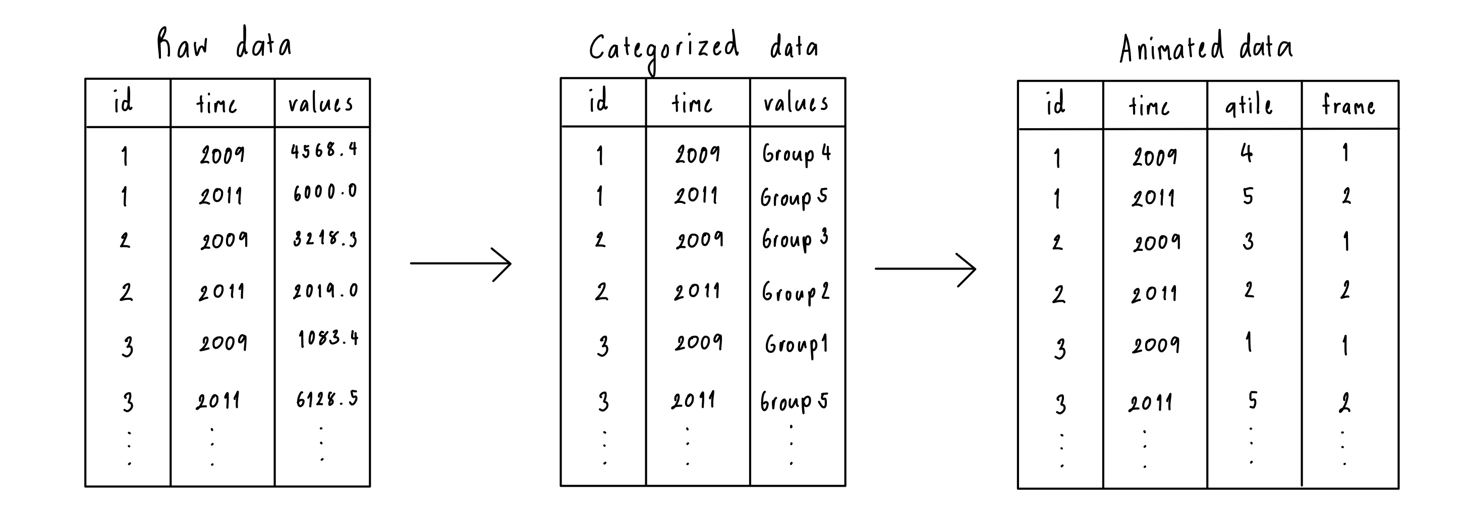
Alt text: A diagram showing the data processing step starting from the raw to categorized and ending with animated data structure. There are three tables, Raw data, Categorized data, and Animated data. The Raw data have three columns, id, time, and values. It then got converted to a Categorized structure with three columns id, time, and values. The difference is the values column is in numerical format for the raw data structure, whereas values for the categorized structure are categorical variables. The last structure is called Animated data which is the transformation from the categorized data. There are four columns, id, time, qtile, and frame. The qtile column represents the category and the frame is assigned based on the unique ID.
Caption: The animation expects data with an ID and a time variable, along with a numerical variable (raw form), which is possibly converted to categorical (categorized). The data can be provided in the raw or categorized form and will be processed into the format needed for the animation, where the categorical variable is treated as a quantile and an animation frame variable is created.
Scatterplot
library(ggplot2)
library(broom)
cars_lm <- lm(mpg ~ hp, data = mtcars)
cars_all <- augment(cars_lm)
ggplot(cars_all, aes(x=.fitted, y=.resid)) +
  geom_point()
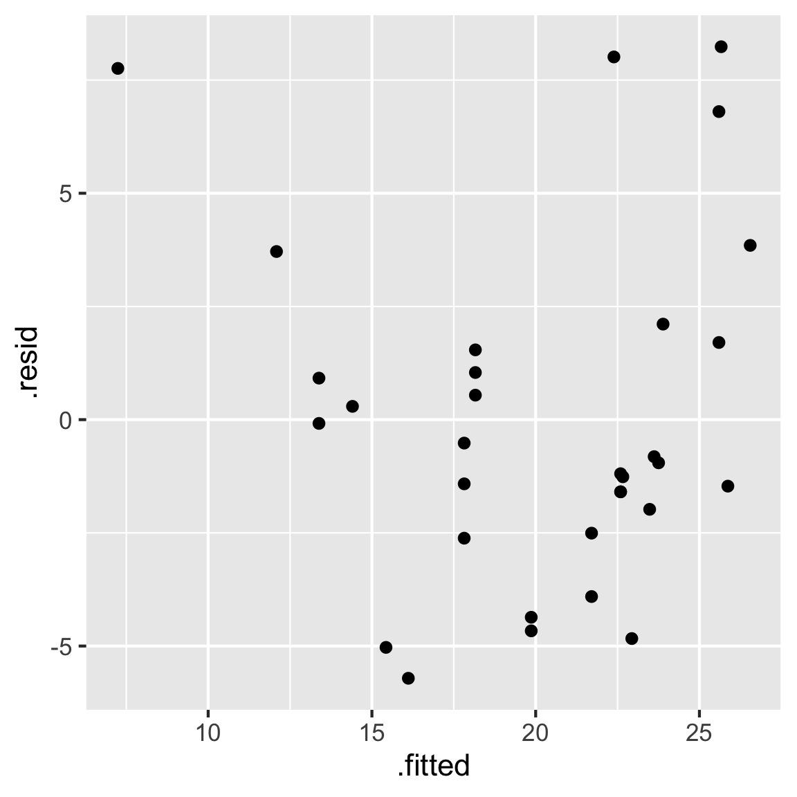
Alt text: Scatterplot of fitted values on the x-axis and residual values on the vertical axis. The x-axis has tick marks 10, 15, 20, 25, and the y-axis has tick marks -5, 0, 5. There is a slight U-shape patterns to the points with one point with lower x-value than others at -12.5, and a high y-value of 7.5.
Caption: Examining the fit of a linear model of miles per gallon on horsepower. Residuals are plotted vertically and fitted values horizontally. The pattern suggests some non-linear relationship is not captured by the model.
Boxplot
library(nullabor)
data(electoral)
ggplot(electoral$polls,
       aes(x=Democrat,
           y=Margin)) +
  geom_boxplot() +
  theme(aspect.ratio = 1.2,
        panel.grid.major.x = element_blank())
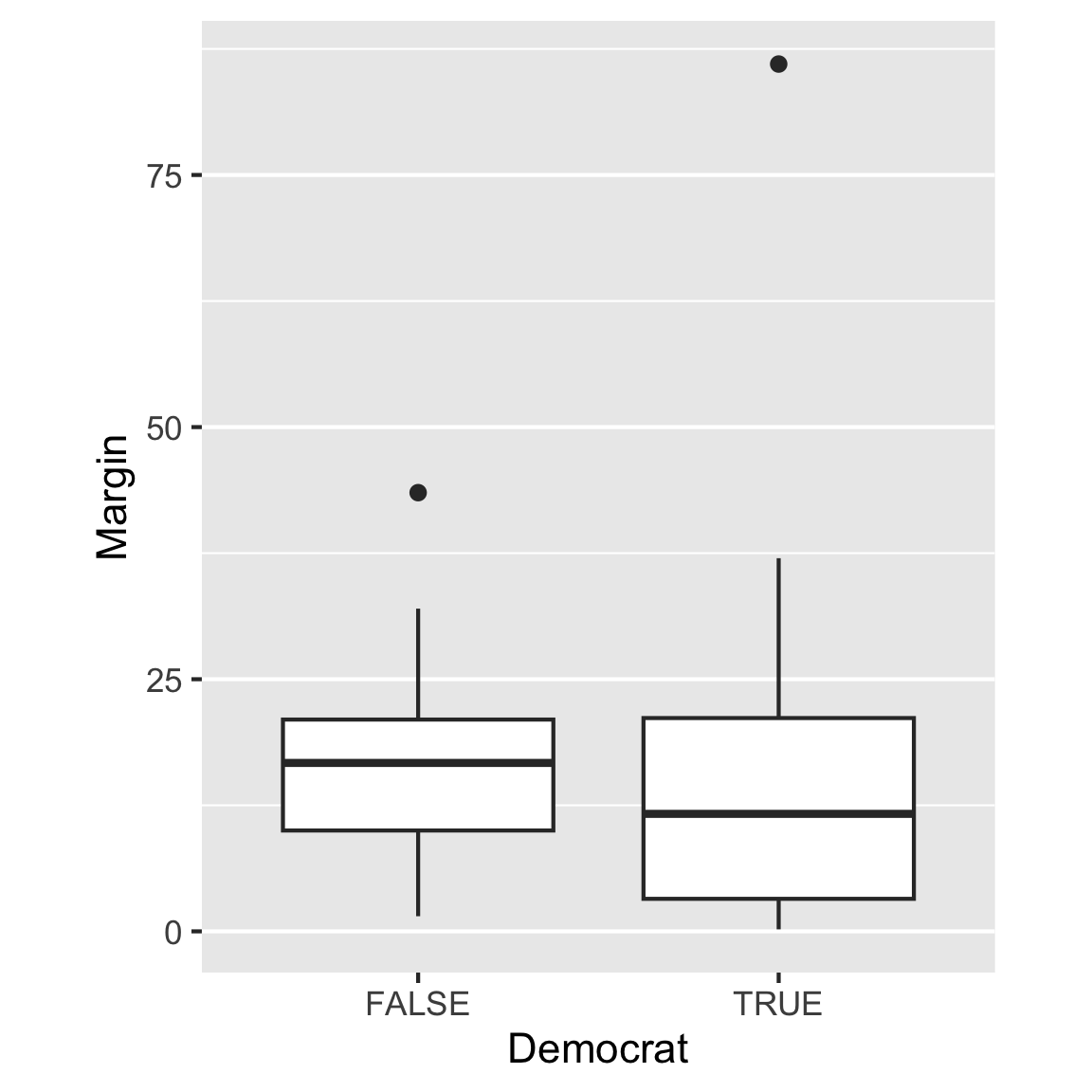
Alt text: Side-by-side boxplots of vote margin for Democrat=TRUE or FALSE. The the y-axis has tick marks at 0, 25, 50, 75. The median for TRUE is around 12, and for FALSE is around 20. The box for the TRUE is about twice as big that of FALSE. Each group has an outlier, at about 80 for TRUE and around 45 for FALSE.
Caption: Comparing the vote margin for electorates based on whether it was a democratic party win or not. The median margin is smaller and the margin is more varied, when it was a state won by the democrats. There is one democratic state with a massive margin of 80%.
Lineplot
library(dplyr)
tb <- readr::read_csv(here::here("data/TB_notifications_2023-08-21.csv")) |>
  filter(iso3 == "AUS") |>
  filter(year > 1996)

ggplot(tb, aes(x = year, y = c_newinc)) +
  geom_line() +
  scale_x_continuous("Year", breaks = seq(1980, 2020, 10)) +
  ylab("TB incidence")
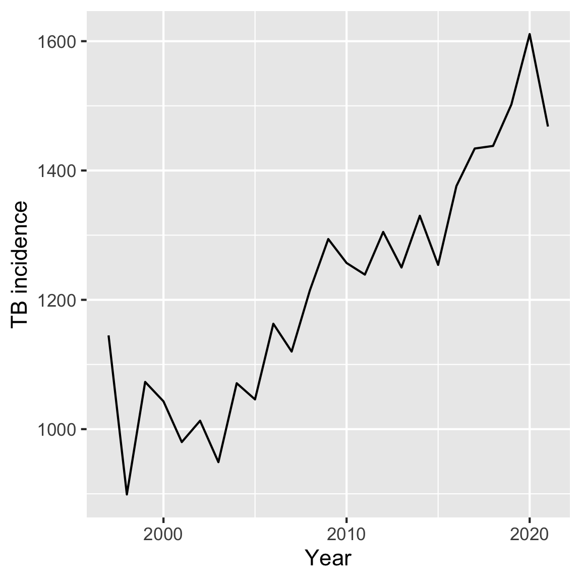
Alt text: A lineplot of Tuberculosis incidence on the y-axis and year on the x-axis. The year ranges from 1997 to 2021, with the tick mark on the x-axis at 2000, 2010, and 2022. The TB incidence has a tick mark of 1000, 1200, 1400, and 1600. The trend of the line is increasing.
Caption: Examining the number of Tuberculosis incidences from 1997 to 2021. The number of incidences has been increasing over the years, with the highest number of TB incidences in 2020 and the lowest in 1998.
Barchart
library(dplyr)
mpg <- mpg |>
  mutate(class = factor(class, levels = c("suv", "pickup", "midsize",
                          "compact", "subcompact", "minivan", "2seater")))
ggplot(mpg, aes(x=class, weight = displ)) +
  geom_bar() +
  coord_flip() +
  xlab("")
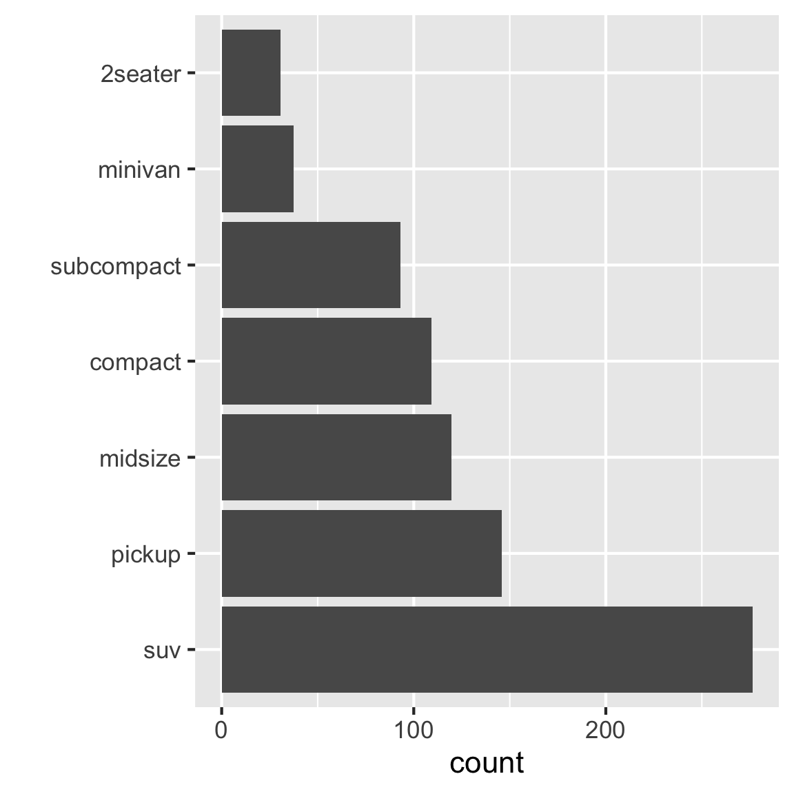
Alt text: Bar chart of numbers of different classes of vehicles. Counts range from 25 to 275. There are 7 classes of vehicle: suv, pickup, midsize, compact, subcompact, minivan, 2seater, corresponding to the order of highest to lowest count.
Caption: Examining the relative popularity of different types of cars. The most popular is SUV, which is almost twice as many as pickups.
Animated visualisation
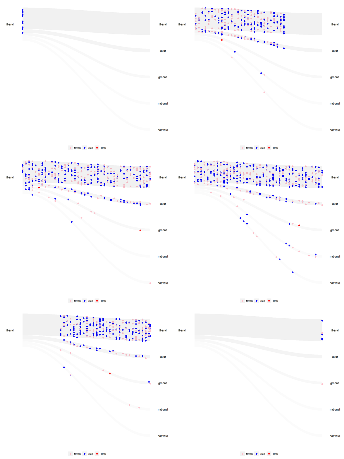
Alt text: An animated visualisation with s-curve shaded area showing the flow of Liberal voters from 2016 to the various parties in 2019, with people represented by dots coloured by their gender identification in the 2016 and 2019 surveys. There are three gender identifications, male, female, and other. Some Liberal did not vote in 2019.
Caption: The wallaby plot visualization shows how the Liberal party performs in keeping the old voters of different genders. Most voters remain loyal to the party, but a small fraction of voters with roughly equal male-to-female ratio switch primarily to the other major party, Labor. Interestingly, the few individuals who identified as neither male nor female (red) overwhelmingly shifted their party affiliations to the Greens.